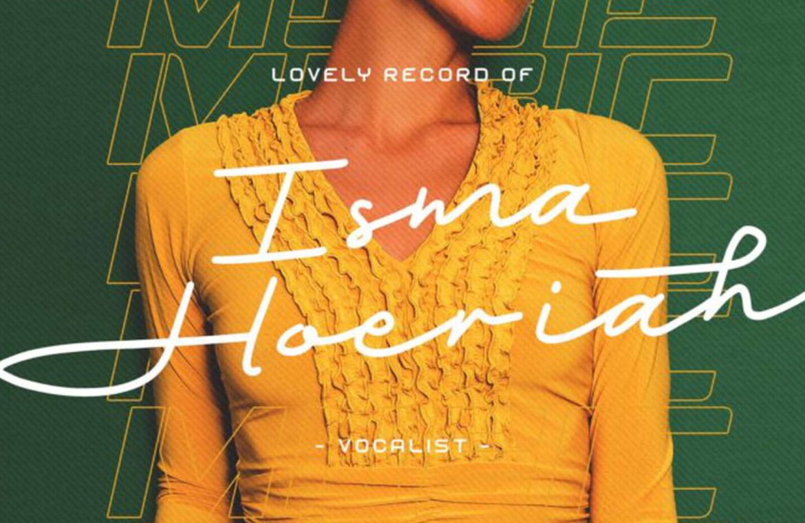
Recently, type foundries have introduced an array of fascinating typography styles. An overview of February 2022’s hottest typographic designs hints at a nostalgic rewind to the dynamic ’70s in design trends this year.
Could the inspiration be drawn from Burger King’s latest successful brand makeover? Unsure, but it seems that a number of typographers aspire to capture those playful, vintage feelings in their upcoming works.
1. Crafty Signs
Crafty Signs takes cues from nostalgic game shows of yesteryears – imagine the likes of Family Feud or the Nickelodeon of the ’90s. Its bubbly, playful letters are ideal for businesses with a distinctive, retro aura, particularly those aiming to attract a youthful audience.

2. Elegant Script of Epicene
Epicene showcases the flamboyance of Baroque scripts with its calligraphy-inspired flourishes. With separate families for Display and Text within the collection, this versatile font set is capable of dressing up your entire website with stylistic consistency.

3. Kingsad’s Unique Character
Kingsad stands out within the realm of sans serifs with its intriguingly distinctive personality. The designers propose using Kingsad for brand identities, while I suggest its innovative character shapes make it especially fitting for the science and tech industries.

4. The Dynamic Lucius
Lucius beams with energy, blending elements of serif and sans serif. The family comes in eight weights and is suitable for a wide array of applications, making it as functional as it is attractive.

5. Retro Flair with Manju
Manju boasts a ‘chewy,’ round design that harks back to the packaging and branding styles famously seen in the ’70s and ’80s. Its bolder variants, in particular, encapsulate the era’s typographic charm.

6. Midnight Sans: A Brush with the Past
Midnight Sans offers a glimpse into the gritty New York City punk scene of the ’70s and comes in Black weight with two variant styles. The font’s raw, underground aura makes it perfect for histories and thematic presentations.

7. Nagel’s Beta Brilliance
Despite being in beta, Nagel has already garnered attention with its clean sans serif look paired with a subtly edgy twist. It remains a font to watch, as future developments like italics and variable styles are expected.

8. Unrefined Charm of Painless
The Painless font has a single style with a textured, robust character. Its laid-back, handcrafted texture might not suit every brand, but it would seamlessly align with homegrown, craft-oriented businesses.

9. Recipient’s Nod to Nostalgia
Recipient harks back to vintage typewriter fonts and offers a breadth of five weights plus matching italics. This makes the typeface suitable for body text and minor headings, imbuing a touch of retrospection to modern layouts.

10. Serene Elegance of Sea Angel
Sea Angel is a serif font that enchants with its fluid curves. It’s effortlessly legible and exudes sophistication, making it ideal for luxury brands, elegant publications, and any platform seeking a touch of grace.

11. Heroic Impact with Smack Boom
Just as comic book culture pervades media, Smack Boom captures the spirit of heroism within its letters. This font would lend a dramatic, captivating aura to branding and digital designs.

12. Athletic Aesthetics of Stoner Sport
Stoner Sport reimagines the classic sports font with contemporary flair. Its outline style can enhance the visual identity of athletic businesses or any enterprise tied to the sporting world.

13. Scandinavian Simplicity in Stormland
Stormland encapsulates the minimalist ethos of Scandinavian design, balancing clean line construction with broad, assertive characters.

14. The Warm Touch of Tellumo
Embracing humanist touches, Tellumo spans Thin to Extra Bold, offering the possibility of either a clean look or a more decorative approach with its swash caps, tailoring to diverse branding needs.

15. The Versatile Yamet Kudasi
Yamet Kudasi brings versatility in script form, transitioning smoothly between uses like a signature line to more prominent placements such as hero images, adapting to various contexts and industries.


