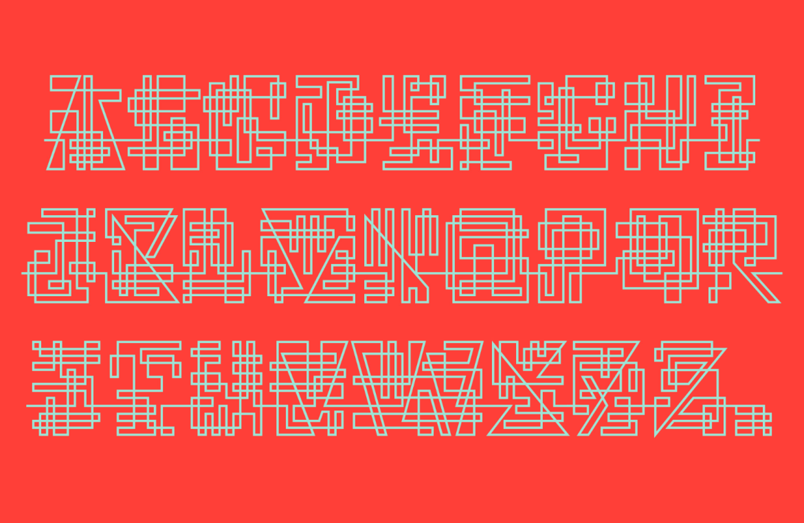
When it comes to shaping the aesthetic of your design, the selection of typeface is key. It’s crucial to have a variety of choices available.
Every four weeks, we compile the finest fresh fonts from across the web. Enjoy the latest picks!
Edition Serif
The Publish family includes Edition Gothic and Edition Sans along with Edition Serif. Originally crafted for the ephemeral Danish paper “Dagen,” this group of typefaces is now accessible to all. Offering a spectrum of weights, this collection is perfect for editorial tasks.

Nostalgia
Conceived by Tida Tep as part of her thesis at Type@Cooper in New York, Nostalgia hearkens back to film noir titles from the 1940s and 50s. Despite its size, it maintains readability and feels at home in dark settings. Currently, the regular weight is out, with more on the horizon, from thin to hefty.

Urban Sign
Urban Sign is a daring experimental font that embraces uniformity to project a neat, contemporary vibe. Influenced by the signage common in Austria, its simplicity suits UI designs and its variances are great for logos.

Wave Script
Wave Script boasts a bold uppercase presence, with its wavy borders giving off an aquatic illusion—ideal for water-themed brand emblems.

Leafy Stencil
Leafy Stencil presents itself with fluid, organic curves and bold stenciling, making it an outstanding candidate for lifestyle editorials or brand identities.

Regal Serif
Regal Serif bears the hallmarks of vintage with its sharp edges and soft curves, ideal for lending a classic touch to branding and titles. It comes in multiple weights, including a variable font option.

Modern Grotesque
Modern Grotesque revives the essence of the international style combined with a 90s flair. It offers excellent legibility across its ten weight variants and is a reliable choice for nearly any use.

Geometrix
Geometrix defies current trends by sticking to its structured, geometric roots with circular and straight lines. It also boasts constricted ascenders and descenders for a snug headline fit and has delightful hidden quirks.

Script Connector
Script Connector is an avant-garde type concept that focuses more on aesthetic connections between characters than readability. Perfect for exploratory logo designers or those curious about typography’s fundamentals.

Eccentric Sans
Eccentric Sans injects a dose of individuality with its contrasting stroke weights, making it stick out in brands or display settings.

Gothic Moderna
Gothic Moderna blends the narrow allure of uppercase serifs with flared flair, offering sublime alternate characters for a touch of the medieval.

Simplicity Sans
Simplicity Sans was designed with a contemporary and balanced visual spirit. With its neo-grotesque base, it delivers straightforward simplicity suitable for corporate identities.

Contrast Serif
Contrast Serif showcases modern elegance with its sharp contrast and ample stylistic flourishes, optimal for selective branding or display applications.

Wild West Slab
Wild West Slab dons reverse contrast to pay homage to the bygone era of the Old West. Featuring a stencil variation, it’s an apt pick for editorials or brands seeking a dash of antiquity, though its optimum display range is limited to large sizes.

Corporate Sans
Corporate Sans is a family of interlinked geometric sans serif that provides a solid backbone for any branding assignment with extensive language support and a wealth of alternatives and figures.


