As we enter 2023, a wave of minimalistic design styles, featuring oversized and brazen typography, is leading website aesthetics. An abundance of text-centric designs is emerging, shying away from elaborate visuals. Get ready to dive into a mix of fresh design concepts peppered with additional visual treats.
Explore the design sensations making waves this January.
1. Stark Contrasts: White on Black
The timeless black and white design scheme remains a staple, enchanting designers for its simplicity, sophistication, and versatility with different content types. Currently, there’s a surge in designs that embrace striking white typefaces set against deep black backdrops.
The visual effect of this design choice compels you to engage with the message being delivered—the text, often succinct and imposing, demands attention.
Here are some distinct interpretations of this monochromatic style:
Bond Agency employs a slightly more elaborate narrative, drawing you in to discover more about their identity, complemented by subtle animations that spark curiosity.

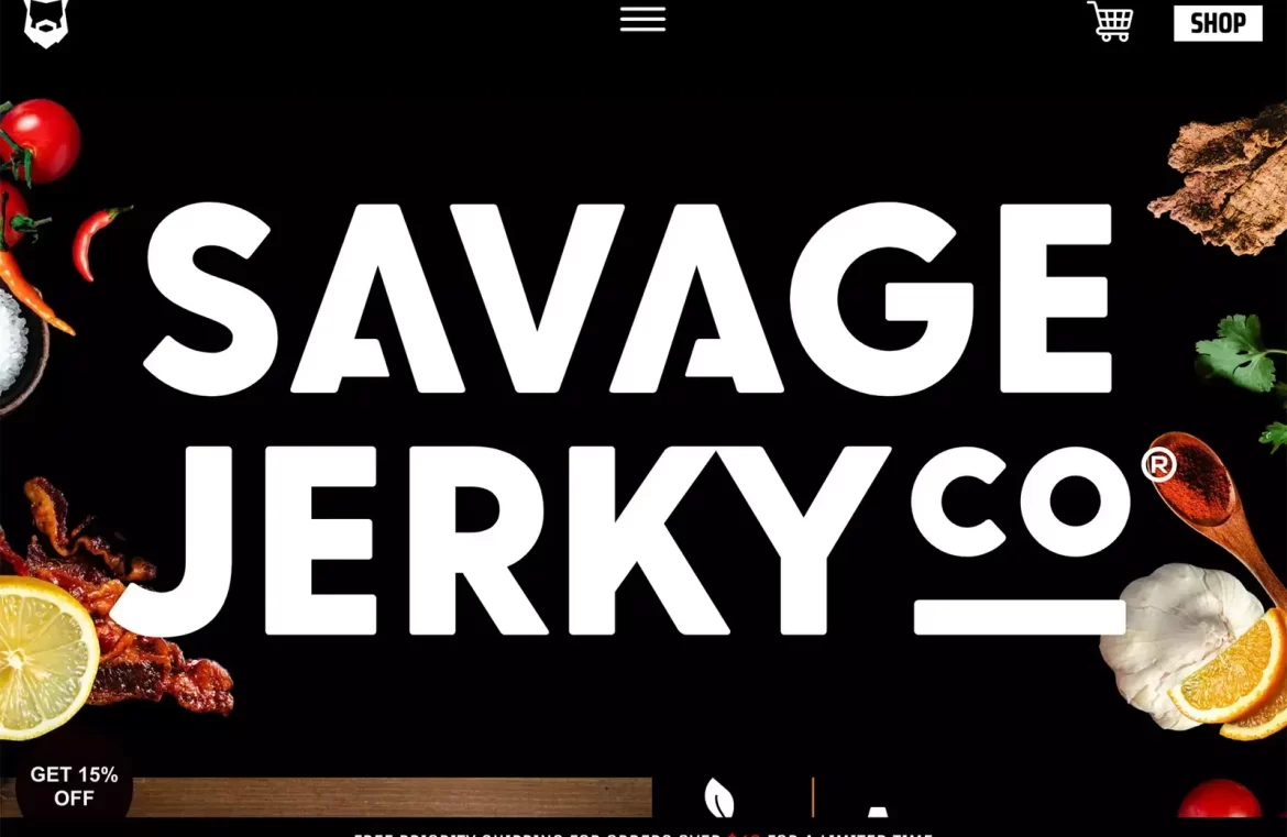
Savage Jerky boldly puts its brand name front and center with minimal distractions. The design’s focus is on its striking “shop” button, intending to streamline the buying process, particularly for those familiar with the brand.

We Are Heavy opts for an ultra-minimalistic approach, allowing three large letters to take center stage, along with a smaller supporting text. The simplicity is intriguing and further accentuated by the playful smiley icon at the page’s footer, adding a splash of color and interactive charm matched by the cursor.

2. Vibrant Orange Highlights
Although not conventionally dominant in the design world, orange is making a splash as an effective accent color. It offers a less aggressive pop than red, creating an inviting yet noticeable impact.
With its rich spectrum from classic orange to peachy or rustic shades, it commands attention whether it’s set against light or dark palettes, serving as an ideal backdrop for textual content.
Its rarity in design also means orange can immediately capture the viewer’s interest.
Ventriloc artfully incorporates orange into their brownish-maroon theme, highlighting critical words, buttons, and navigation links. The continuity of the orange accents throughout the design helps to maintain visual coherence as the primary hues change.

Briteweb enhances its brand presentation with a simple orange geometric form that gracefully guides the viewer from the logo to the page’s headline. This splash of color remains a clickable highlight, creating a visual thread throughout the user’s journey.

Hackney Locksmiths adopts orange primarily for branding, yet subtly weaves it into the web design. This integration fosters a traditional, legible aesthetic. Additionally, the orange banner atop the webpage links the digital presence to their physical identification via the logo.

3. All-Text Homepages
Building on previous trends, all-text homepages are gaining popularity. Unlike our initial examples, there’s no chromatic limit here, and typographic styles vary widely.
The intention behind these layouts is clear: to make readers pause and consider the message. In doing so, the design becomes highly selective, resonating with the right audience or risking immediate bounce-off.
This approach holds potential risks but can be highly effective for the target demographic.
The Design Threads report homepage greets you with a straightforward preview of what to expect, and even the call to action invites continuous scrolling through text alone. Deeper into the report, you’ll uncover sporadic color and art, adding dimension to the design narrative.

Arazzi Contemporanei presents a text layout that may challenge readability, with layered typography and a down-page navigational hint that’s highlighted in green. It’s a polarizing design, leaving you to ponder if it’s ingenious or overwhelming.

Simple Flair shares similarities with the previous example but offers a clearer reading experience. The homepage is void of imagery, displaying text with subtle embellishments of underlines and italics, prompting the eternal question: is it a hit or miss?

Finishing Thoughts
All these emerging trends share a common thread: a return to minimalist design principles. Minimalism is a timeless influence in design that ebbs and flows in prominence. In 2023, we’re witnessing a resurgence, with designs embracing a leaner, more focused aesthetic.

