This June, we’re diving into the ever-evolving realm of web design, particularly focusing on innovative navigation menus. The digital landscape is buzzing with fresh patterns in menus, with a special emphasis on seamless functionality across various devices.
Designers are leaning towards pared-down menu styles for their sheer simplicity and to achieve a neater aesthetic appeal. Here’s a scoop on the navigation styles making waves right now.
Here’s the rundown of the top navigation trends for this month.
1. Innovative Pop-Out Menus
With a nod to mobile usability, pop-out menus are now a hit across all devices.
Not long ago, this would have seemed impractical, but users’ growing fondness for such menus on mobile has paved the way for wider acceptance. A staple feature is the hamburger icon, located typically at the top-right corner, creating a familiar setting for users, despite some sites opting for varied placements.
The pop-out phenomenon varies widely, taking on unique appearances and functionalities. Let’s look at three distinct examples:
Rizzardi Yachts showcases a full-screen pop-out menu, with an unexpected left-aligned hamburger icon. It unfurls into a comprehensive menu, complete with branding, animated hover effects to prompt interaction, and even footer content such as social icons and policies.

TomB presents a semi-screen pop-out on desktops, mirroring a mobile-friendly navigation area. It suits succinct menu labels and keeps the brand visibility intact. The clear closure mechanism eliminates user confusion, common with full-overlay designs.

Made by Field flips the script by hiding navigation within a circular icon, expanding to a full menu on click. It foregoes prominent branding for a minimalist approach, highlighted by distinct hover styles such as background imagery on one side and subtle animations on the other.

2. Streamlined Minimal Menus
Taking a cue from the above examples, minimal menus here are stripped down even further. They are not just visually minimal but offer fewer choices, crafting a curated journey for the user.
This navigation choice is especially suited for smaller websites or ones where each page is a stepping stone to the next action.
With minimal menus, the real magic is in guiding the user effortlessly. Is the intended action clear? How are they meant to engage with the site?
Dior by Starck is elegantly simplistic with its one-page scroll, meaning a logo, language toggle, and sound control suffice as navigation. The text overlaying the scroll implicitly suggests more content down below, nudging the user onwards.

Magma follows a template akin to TomB, but adds a prominent call to action next to their hamburger icon. The layout communicates “Book a Demo” as the primary focus but offers more options upon exploration.

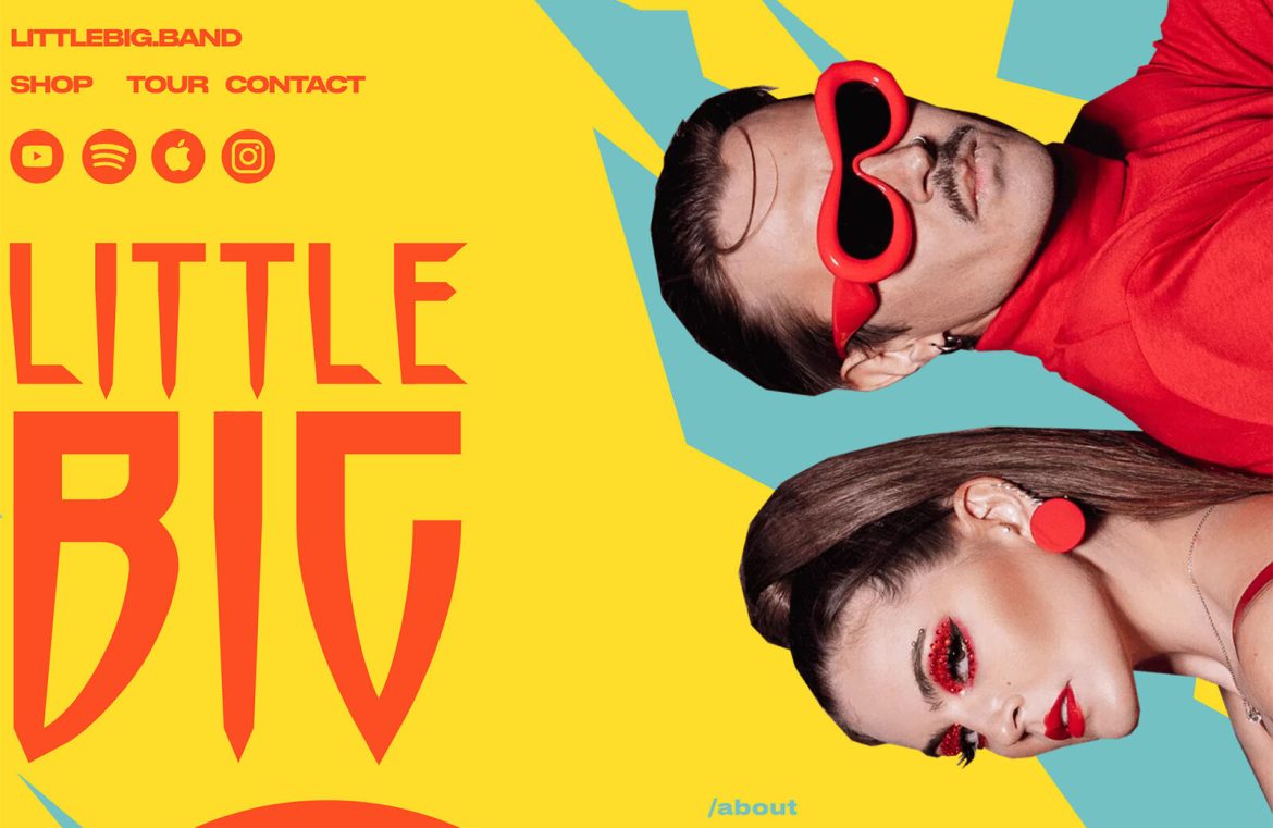
Little Big masters minimalism with a menu nestled in the top left corner. Onsite navigation is limited, while additional buttons link to external platforms, directly connecting users to their music.

3. Intersecting Design Elements
Navigational elements playfully interacting with other design aspects can be challenging yet visually enchanting. Here, menus retain their traditional top alignment but are gracefully integrated with other inviting design features.
This trend marries classic usability with innovative visual engagement.
The Works Fine for Me podcast uses familiar navigation layout but adds a splash with a descending photo section, directing attention to the navigation and fostering visual continuity.

Taby vs Spacje introduces an element rising from the bottom, subtly segregating navigation text and buttons, yet collapsing on smaller screens for optimal legibility.

Stripe Sessions features an animated backdrop for the central navigation, with the peripheries accented in whitespace, drawing even more focus.

Parting Thoughts
Sometimes, trends nest within trends, offering a layered perspective.
Are these navigation design evolutions something you’d consider for your projects? We aim to inspire with these creative and functional insights to keep your digital presence on the cusp of modernity and innovation.

