1. Intrusive Pop-Ups
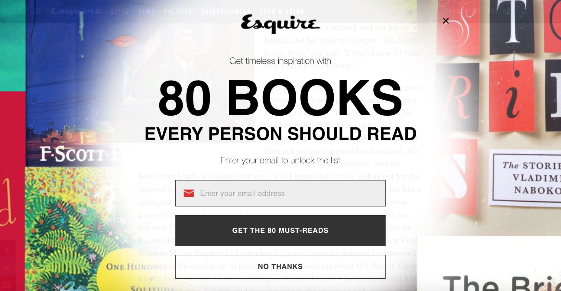
The most aggravating element online is likely to be unanimously voted as “Pop-ups.” Notoriously known for ruining the browsing experience, according to the NN Group, pop-ups top the list of offensive web experiences. Imagine landing on a webpage that piques your interest, and as you immerse yourself in the content, a massive, unsolicited overlay barges in, pleading for newsletter sign-ups or dispensing offers. Most of us would instinctively dismiss the pop-up or navigate away from the page entirely.  An intrusive overlay on the Esquire website. Pop-ups are widely used for a reason: advertising revenue. Yet, the approach is counterproductive, generally resulting in visitor irritation. Introducing a pop-up is essentially asking users to pause their intended activity to pay attention to something the website owner deems more important. However, irritation can be minimized by timing the pop-up appropriately, like at the end of the page, after visitors have engaged with the content and may be more receptive to further interaction. The language in the pop-up also matters. It should be straightforward and respectful, avoiding any form of trickery or confusion. Some websites, like Waitbutwhy, even sprinkle humor into their pop-up copy to charm their visitors:
  The clever and witty copy on Waitbutwhy’s pop-up. Less intrusive alternatives, like slide-in bars, exist and can achieve similar conversion rates without taking over the entire screen.
2. Never-Ending Scrolling
Infinite scrolling made its mark in the mobile era, appealing due to the convenience of scrolling over clicking on small screens. While it seems like an effortless way to access massive amounts of content, it’s not the holy grail for every site. Its primary flaw is also its main selling point – the lack of an end marker. This means users cannot bookmark their current location to return to later, resuming where they left off becomes a chore. In 2012, Etsy found that their infinite scrolling design underperformed compared to their older pagination style, with user engagement dropping despite stable purchase rates. Notably, infinite scroll is effective for platforms like Twitter or Instagram, where users casually browse an ongoing stream without a specific target in mind.
3. Overbearing Push Notifications
We’re constantly pelted with countless notifications daily, and only a few catch our genuine interest. The excess often disrupts our focus and can become an annoyance.  A streaming service informs every user about every new episode release. Overwhelming notifications lead to app deletions, as reported by 71% of surveyed users. Nevertheless, push notifications are potent when they are personalized, relevant, and timely. Effective notifications engage users by delivering valuable content at opportune moments.
  Netflix exemplifies personalized push notifications.
4. Disruptive Scroll Hijacking
Taking control away from users, scroll hijacking results in an unpredictable and often frustrating browsing experience. Although it’s typically best to avoid this technique, certain sites like Tumblr have used it effectively to segment content into digestible parts.  Tumblr’s homepage utilizes controlled scrolling.
Conclusion
It’s crucial to recognize that the UI approaches highlighted above aren’t inherently negative. The user’s disdain for them stems primarily from their improper and indiscriminate use. Thoughtful, moderated application of these techniques, anchored in user needs and preferences, is essential for a positive user interface experience.

