A glance over the past year reveals significant strides in web design. The creativity was unmissable, and certain design practices clearly left their mark.
As we prepare to bid adieu to 2023, let’s take a moment to appreciate the web design trends that lent this year its creative flair.
Here are the ten impressive web design trends that are here to stay and could serve as inspiration for your upcoming projects in 2024.
1. Slide-Out Menus
The dynamic shift towards seamless slide-out menus has been an influential aspect of 2023’s web design, blending the user experience across different devices and screens.
Initially met with hesitation, this approach has grown in popularity due to its ubiquitous presence on mobile devices.
Typically featuring the hamburger menu icon, it’s situated in the upper right corner, while the logo holds its ground in the opposite corner.
A standout example: Rizzardi Yachts showcases a full slide-out navigation, deviating slightly with its hamburger icon placement to the left. Its navigation screen spans the full display, offers intuitive hover effects, and neatly packages footer details and social links.

2. Sophisticated Serifs
Back in February, we were raving about the resurgence of serif fonts in web design – an elegant turn of events!
Despite their upswing in popularity, serifs trail behind sans serifs in usage. However, they introduce a typographic charm to designs without overpowering other elements.
A perfect instance: Mbau keeps things minimalist with a graceful serif headline, unfaltering atop a tranquil background video. Crafting a refined ambiance suitable for a luxury travel site, this design effortlessly combines exclusivity and simplicity.

3. Circular Text with a Twist
Recognizing the allure of circular text since August, web designers have embraced the spinning effect, making for memorable yet unconventional reading experiences.
While these animated text designs grab your attention, they maintain brevity for ease of reading.
A noteworthy portrayal: Pear uses a dynamic text ring alongside its branding, cleverly guiding users towards the call to action for the app right below it.

4. Text on the Move
Merging text and motion can elevate basic web interactions to an engaging spectacle. While motion may not seem suited for all, its adaptability may surprise you.
Key here is to balance motion and readability, ensuring user accessibility is not compromised.
What captivated us: Alfred exemplifies this blend with scrolling text over a lively background video. The motion is subtle and the text sparse, uniting to form a coherent, kinetic user experience.

5. Vertically Framed Media
Identified in March, the trend of utilizing vertical media continues to charm for its ability to bridge device format gaps. Yet, it doesn’t come without challenges for traditional desktop layouts.
Designers often employ a split-screen design to meld these media formats together; one side for text and the other for visual content.
Capturing our interest: Klaus Heller ditches the traditional split-screen for a composition where the text commandeers over two-thirds of the space, creating a striking visual balance.

6. AI Evocations in Graphic Art
2023 could be dubbed the year of AI, influencing website designs significantly with AI-inspired visuals.
Traits of this trend include minimalist layouts, subdued typefaces, and shadowed silhouettes, all maintaining an element of mystery.
The conundrum lies in the familiar feel of these AI renditions—a blend of the abstract and the relatable.
An inspiring example: Mugler uses a fluid AI figure as a backdrop, alluding to the company’s foothold in NFTs. The figure sits in a space between humanity and machine.

7. Delectable Food Imagery
Culinary presentations require stunning visuals. Mediocre photography isn’t an option for those in edibles.
Good imagery is essential, but how it’s framed within the design determines its effectiveness.
Illuminating this trend: Nurishh synchronizes the color palette with the product, crafting an appetizing presentation that reflects the product shapes on both sides of the screen.

8. Contrasting White on Black
As we noticed in January, the classic white-on-black combo owes its enduring appeal to its simplicity and versatility, catering flawlessly to various content forms.
This year, designers have bolded their approach, harnessing the stark contrast to make a statement.
Commanding our attention: Savage Jerky presents its brand in an oversized, striking manner, with minimal distractions guiding users towards purchase.

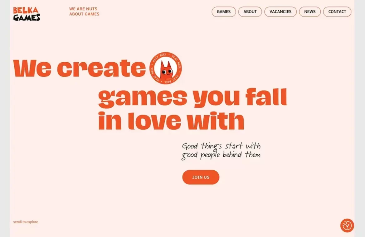
9. Uniform Hues with Monochrome Palettes
The monochromatic palette brings a unifying and graceful air to web designs. This single-hue approach exudes a polished aesthetic, inviting various iterations.
It’s the delicate interplay of monochrome and text contrasts that heightens readability and the user experience.
A pleasing representation: Belka Games utilizes a punchy coral theme, offset by a soft background and lively text, crafting an accessible and buoyant atmosphere.

10. Curvaceous Card Interfaces
Card design elements gained a softer touch this year, eschewing sharp edges for rounded corners. This gentle approach to card visuals enhanced multimodal content displays.
Whether featuring flat or three-dimensional aesthetics, individually or as part of a hover effect, these cards proved their versatility.
An example to behold: GET opts for tall, vertical cards with a gentle curvature. The cards excel as natural focal points on the homepage, enticing interaction with their design.

In Summary
Reflecting on 2023, it’s clear that the world of web design was rich with innovation and practical, engaging trends. As we edge into 2024, the excitement for continued creativity is palpable.
Delve into our full array of trend recaps here.

