As we peer into the digital horizon, current web design trends present a fascinating preview of the future, showcasing complete aesthetic concepts rather than the more discrete tweaks we’ve grown accustomed to. This month spotlights the sophistication of monochromatic schemes, the structured beauty of magazine-style spreads, and inventive approaches to user navigation. Here, we’ll take a closer look.
Let’s dive into this month’s design movements:
1. The Allure of Monochromatic Magic
Designs echoing a singular hue can captivate and charm onlookers. A monochromatic strategy employs varying shades, tints, and intensities of a base color, crafting an atmosphere of subtle elegance.
As any seasoned designer would attest, such simplicity in appearance belies the complex thought process behind it. Crafting a user-friendly monochrome website requires deep consideration of contrast and accessibility.
The approach involves blending backgrounds, textures, and typography. Vast possibilities unfold, depending upon how these elements are married together.
The secret sauce? Achieving the delicate balance between creating the right ambiance and preserving crystal clear legibility. This often means combining a single-color theme with stark text to maintain focus.
Belka Games impresses with a coral-infused theme, balancing a whisper-soft backdrop with vivacious text for an engaging, legible presentation, further spiked with dark accents.

Deadly Secrets of Color Green incorporates a green-engrained pattern with animated layers, offering an intriguing design that remains consistently hued even as the text transitions to white, maintaining that monochromatic vibe throughout its execution.

TwinBru brings a surprising beige-mauve palette to life with clever animations, giving a sensory experience that ties in perfectly with their performance fabric narrative.

2. Editorial Elegance: Magazine-Style Layouts
Employing magazine-style layouts embodies timeless charm while feeling both nostalgic and forward-facing. Echoing print origins, these digital canvases combine arresting visuals with airy space and prominent titles.
Subtle animations may weave through these designs, yet they often maintain a flat, classic appearance, with content neatly segmented for a clear, easy-to-scan format.
A magazine-style approach not only appeases the eye but also requires meticulous planning to align elements harmoniously.
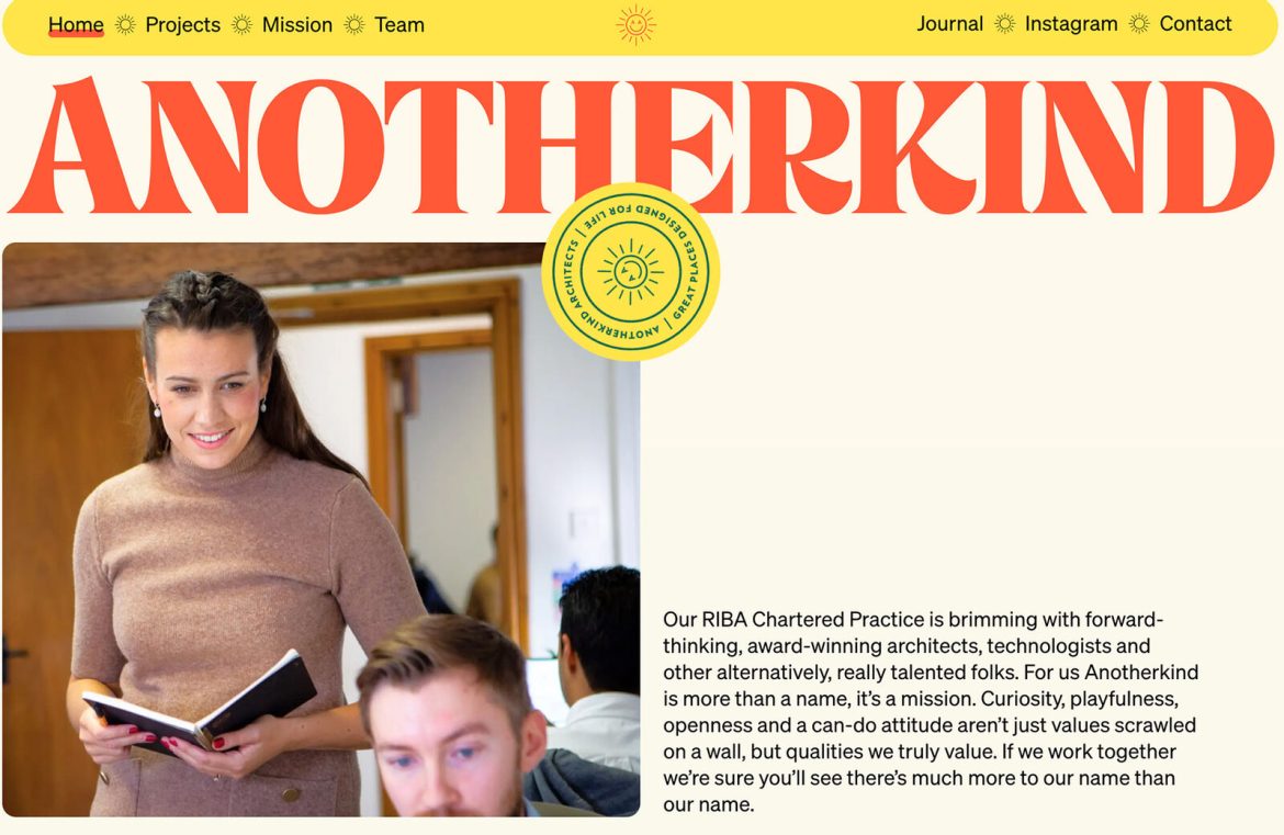
Anotherkind garnishes its homepage with a nod to yesteryear through a bold, serif title in orange, guiding viewers effortlessly down the interface while saluting its print heritage.

Synchrodogs presents a strong print-inspired aesthetic, with attention-commanding headlines and navigational cues subtly nestled in colorful boxes that could easily be missed due to their diminutive size in relation to other elements.

Brooklyn Editions displays a variation on the theme, keeping its design rooted in magazine style while introducing visual surprise, simulating the sensation of turning pages between content blocks.

3. Boxed-Up Navigation: A Contemporary Spin
Ensuring navigation is a breeze for users lies at the core of web design. By boxing navigation elements, designers guarantee these crucial points stand out in their dedicated spaces, unencumbered by busy backgrounds.
Whether they’re fixed or floating, boxed navigational aids are surging in popularity for their user-friendly visibility and interaction.
The configuration of these navigation boxes can vary greatly, offering a canvas for creative flair. Here, we explore different interpretations:
Brand New School opts for a classic, horizontal navigation box, pairing its logo with links inside a clean, white ribbon. An engaging toggle switches the color scheme, simultaneously altering the navigation’s backdrop.

Gotham NYC explores a dual-box concept, setting navigational elements above a secondary box containing details like address and hours, all rounded off for added visual comfort.

DPTO fully invests in the boxing theme, choosing a striking yellow to encapsulate navigation at the screen’s base. It’s a bold relocation, anchored by the box’s presence to ensure cohesion.

In Summary
While the highlighted design inclinations for September might not be revolutionary, they each require an all-encompassing view of site design for successful application. These ideas are particularly stimulating as blueprints for brand new ventures. Embrace the excitement!

