The tracks of website design trends do not come to a halt even during the balmy days of summer. Instead, we witness the subtle blossoming of new design approaches, often refining the current digital landscape rather than introducing radical changes.
Let’s delve into the design movements gaining momentum this month.
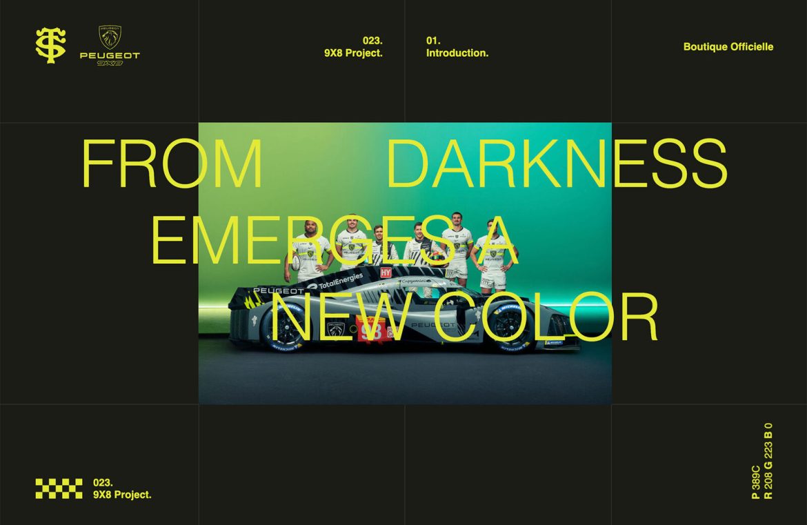
Bold Text on Dark Canvases
The elegance of dark themes persists in popularity, owing a nod to the ubiquity of dark mode preferences.
What’s becoming more prevalent is the transition in text color from the classic whites to vivid and lively hues. This infuses designs with a joyful undertone, diminishing the starkness dark themes may sometimes present.
Vibrant text shades can enliven a pitch-black backdrop, ensuring that legibility is not compromised. Yet, the real challenge emerges when lighter secondary elements are introduced, which could potentially jeopardize readability.
The 9×8 Project features eye-catching neon yellow tones, demonstrating that while vivid colors may risk readability against complex backgrounds, they hold up well against darker areas and remain legible even in smaller sizes.

Dan Iqbal incorporates a rich, dark backdrop with an arresting orange for text in his portfolio, striking a balance between readability and visual appeal. The spinning text in the background adds an innovative touch.

On the other hand, Keelvar takes a leap with an unconventional bright purple that unifies various design elements with panache.

Rounded Corner Cards
The dynamic nature of card elements knows no bounds, with the latest iteration featuring rounded corners, often employing a consistent curvature.
These stylistically versatile cards can adorn any design, showcased below as they seamlessly meld with stark white backdrops, animated presentations, and even layered in a nearly brutalist aesthetic.
The rounded-edge cards may appear minimalistic, be dimensional with shadows, or come alive with animations or hover effects. Their content ranges widely from imagery to typography, video, or even a mix of mediums.
Let’s examine how this design aspect is being utilized across different platforms.
GET opts for simplicity with vertical, rounded cards that incorporate text and calls to action. The cards serve as striking visual anchors on the homepage and provide interactive navigation prompts.

Same Same Studio arrays a kaleidoscope of small cards, each acting as a vibrant button that reveals its purpose upon hover. The assorted contents within these cards showcase the vast potential inherent in this design technique.

Zach Hayes layers his portfolio with a card-inside-a-card motif, all embracing the same rounded-edge motif, set against a bright white theme that enhances the designs’ minimalistic brutality.

Staggered Zigzag Layouts
These designs might leave you pondering the whereabouts of the traditional grid. Zigzag configurations of text and visuals can induce a harmonious or precarious ambiance, depending on their application, establishing a unique visual rhythm that can enliven homepages or entire website themes.
This staggered alignment can manifest vertically, horizontally, or in a step-wise fashion, creating an illusion of chaos while still adhering to a half-grid, which helps maintain a clear trajectory and precise positioning for design components.
To achieve an effective zigzag pattern, a balance must be struck in the number of elements incorporated; too few may fail to establish a pattern, while too many can overwhelm. A sweet spot tends to be between three to seven distinct segments.
Mocha Café and Bar exemplifies the zigzag approach with playful lettering in the business’s name. The dual horizontal text baselines offer structured control amidst the typographical exuberance.

Swiss Deluxe Hotels employs both vertical and horizontal zigzagging, which, though visually compelling, reveals the challenge of ensuring adaptability across different screen sizes. The design excels on larger displays where its intricacies can be fully appreciated.

Oaks Lane gracefully utilizes a stair-step image sequence that cascades from the homepage down through the design. The alternating top line for images or below the frames, this zigzag style exudes elegance but necessitates meticulous photo curation to achieve its full effect.

Concluding Thoughts
The allure of these subtle trends lies in their seamless integration capabilities into existing projects. This gradual design evolution can result in a fresh new look without the need for extensive redesign efforts, offering an attractive path for design teams and audience alike.

