
1. Prioritize Clarity and Scannability
Consider the fact that users quickly scan web content to determine their next course of action. Forms must be designed in the same vein; at first glance, users should be able to discern the required information. To create a form that stands out for its readability:
- Use high contrast: Keep text succinct and legible, opt for traditional text and background color schemes like dark text on a light background.
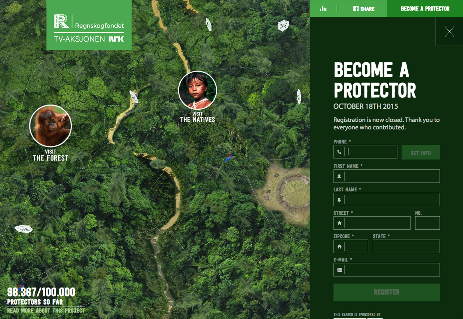
- Logical grouping: On longer forms, categorize related information (e.g., personal details, payment, and shipping information). Smaller, logically arranged sections make the form less intimidating than one extensive set of fields. Ensure that spacing clearly associates labels with their respective input fields.
- Clear submission cues: The submission button should be prominent and its microcopy should unambiguously indicate the result of the click – “Submit”, “Make Payment”, or “Next”. Also, provide clear confirmation to the user once the form is successfully submitted.
2. Adopt Interactive Labels
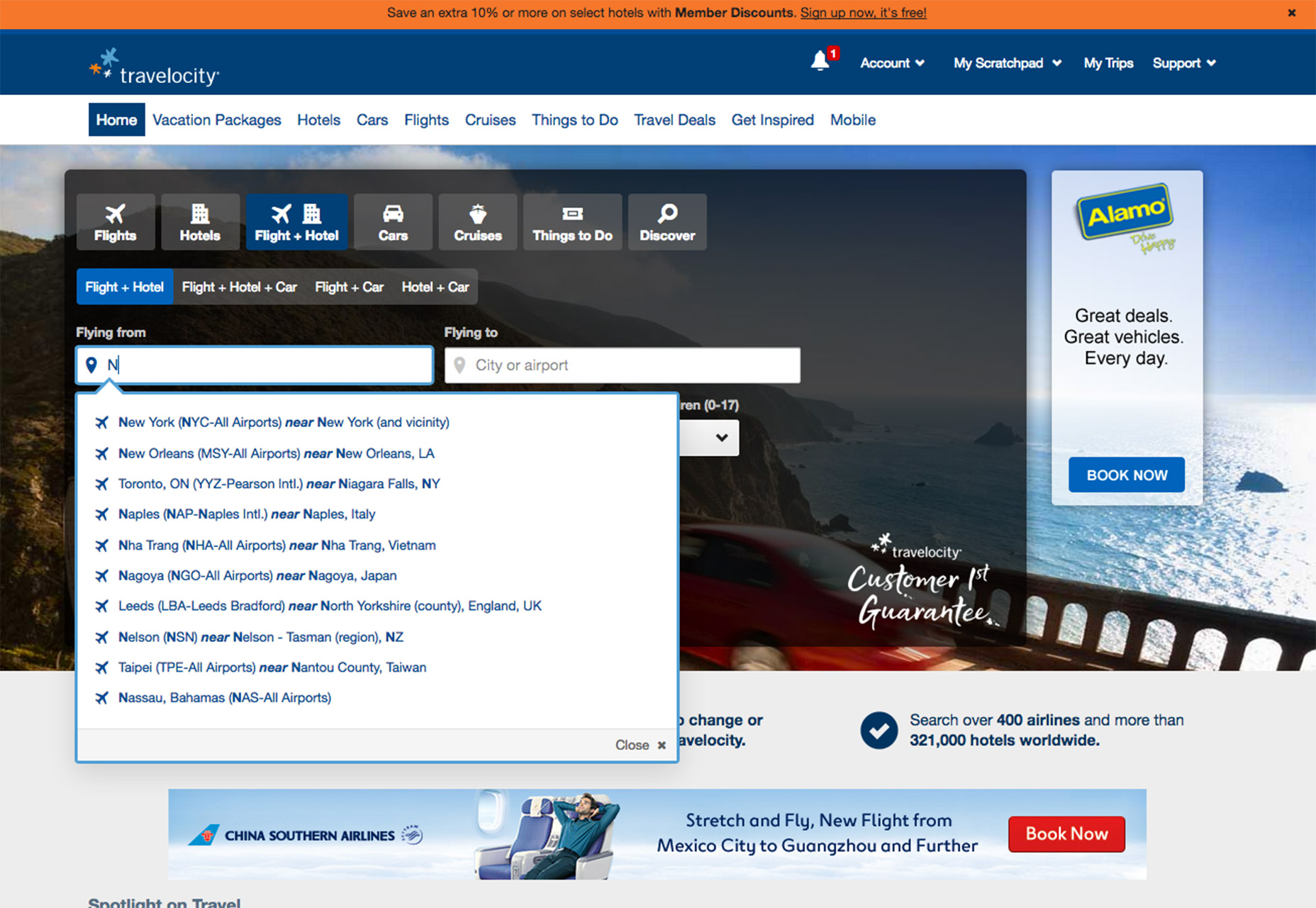
The use of placeholder text inside form fields has been contentious, largely because it can become an obstacle if it doesn’t disappear easily, forcing users to manually remove it. Conversely, vacant fields can enhance focus and minimize confusion. If you’re considering providing hints, interactive labels are a viable alternative. These labels appear as placeholder text and gracefully animate to a prominent position when the field is selected. This keeps the hint accessible without hindering the user’s input and adds a touch of animation for a pleasant user experience.
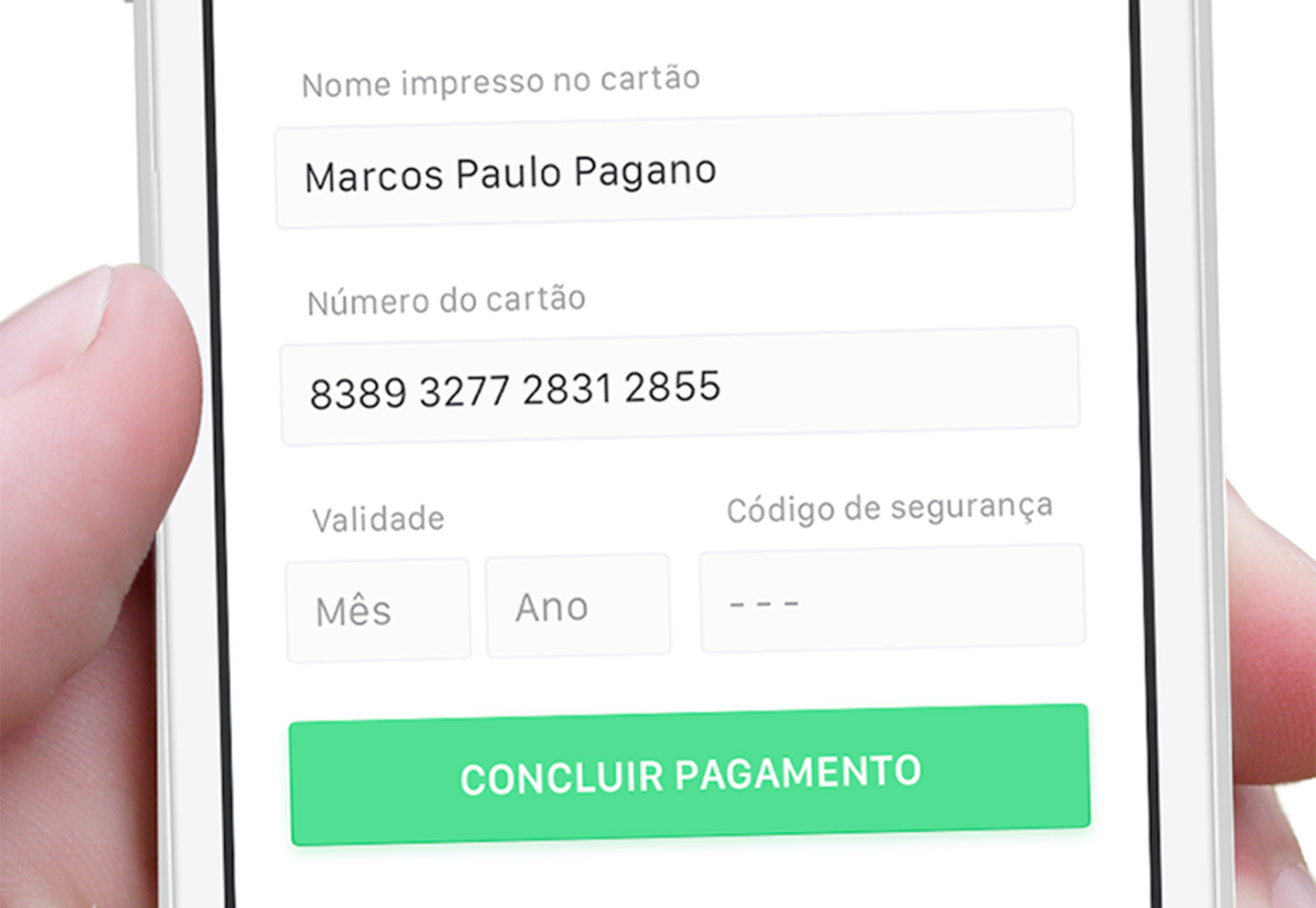
3. Implement Field Masks for Clarity
Field masks serve a similar purpose to placeholders, but they improve usability by intervening only when a field is in use. They help users input information correctly by formatting it in real-time, which can prevent errors. A classic example is the phone number; different formats can confuse users, so a field mask would automatically organize the input as the user types, allowing them to focus solely on entering their number without switching between keyboard layouts, especially on mobile devices.
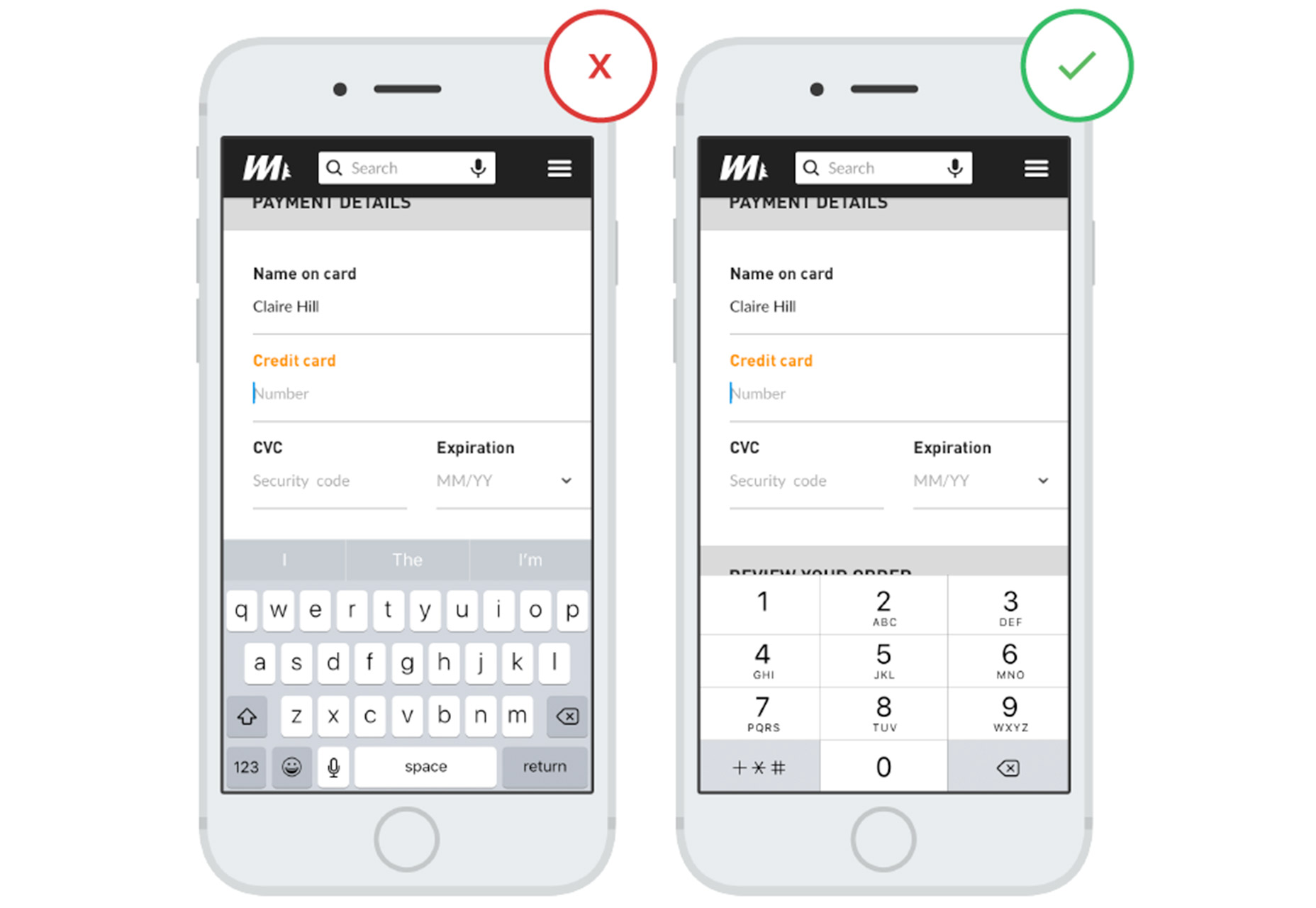
4. Facilitate Keyboard Navigation
Without knowing the device a user will be on, your form should still offer seamless input across all platforms. For desktops, make sure users can tab through fields without relying on a mouse. Mobile forms should prompt the most appropriate keyboard—for example, numeric for phone numbers and alphanumeric for text input. Proper keyboard facilitation is a detail users greatly appreciate.
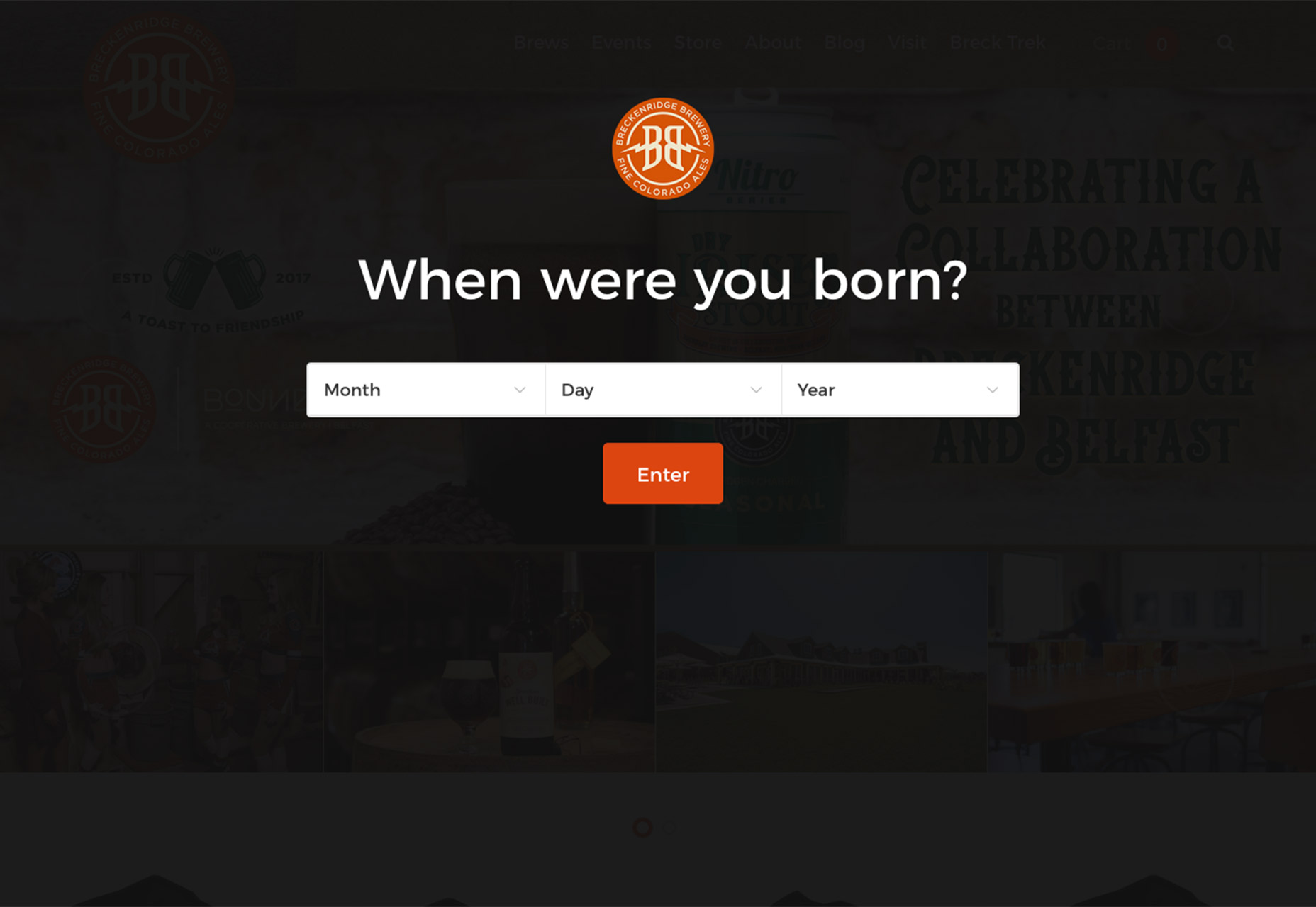
5. Organize Forms Vertically
Vertical layouts in forms are much preferred by users as they are inherently easier to complete, particularly on mobile devices. Tightly integrate all fields in a single-column view that fits within the screen to eliminate the need for scrolling. Always arrange form elements logically—for example, following the natural order of a person’s name and contact information.
6. Minimize Required Typing
Introduce pre-fill solutions to streamline form completion, which is especially convenient on mobile devices. Not only does this approach minimize the amount of data entry required from users, but it also decreases the likelihood of errors. Smart suggestions for fields such as email addresses can enhance user experience dramatically, prompting users with common email domains to expedite their input.
7. Keep Your Forms Brief
Resist the temptation to ask users for a profusion of details. The likelihood of form completion increases when users perceive that it requires less effort and time. Streamline your form to ask only for essential information, and leave additional queries for subsequent, more personalized communications, which users may be more inclined to engage in once they’ve initially opted in.
Conclusion
Offer users a rewarding experience for their effort in filling out your form. Whether it’s a fun element, a thank you message, or simply the ease of use, a well-considered form design can significantly improve data collection and encourage repeat visits.
